Wabi-sabi interior design is a Japanese-rooted approach that finds beauty in imperfection, age, and the natural world. Instead of glossy symmetry, it favors handmade objects, raw materials, muted earthy tones, and calm, uncluttered rooms — spaces that feel quietly lived-in, honest, and at peace with the passage of time.
What is wabi-sabi interior design?What is wabi-sabi interior design?
Wabi-sabi interior design applies the centuries-old Japanese worldview of wabi-sabi — accepting imperfection and impermanence — to the home. It builds rooms around natural materials, handmade pieces, irregular textures, and a restrained, earthy palette, so the space feels grounded and serene rather than staged or new.
The two words carry the idea. Wabi points to rustic simplicity and quiet humility; sabi describes the grace that comes with age and wear. Together they celebrate a cracked glaze, a weathered beam, or a hand-thrown bowl as more beautiful than anything flawless and mass-produced. In a wabi-sabi interior, nothing tries to look perfect, and nothing pretends to be finished.
The 7 principles of wabi-sabiThe 7 principles of wabi-sabi
Wabi-sabi draws on seven Zen aesthetic principles. Each one translates directly into a design decision you can see in a room.
- Kanso (simplicity) — strip a room to what matters; remove the clutter, keep the essentials.
- Fukinsei (asymmetry) — balance through irregularity rather than mirror-image symmetry.
- Shibumi (understated elegance) — quiet, effortless beauty with nothing shouting for attention.
- Shizen (naturalness) — materials and forms that feel organic, not forced or over-designed.
- Yugen (subtle grace) — suggestion over statement; depth you sense rather than see.
- Datsuzoku (freedom) — breaking from convention and rigid rules.
- Seijaku (tranquility) — a settled, calm stillness throughout the space.
Key characteristics of a wabi-sabi interior
Most wabi-sabi rooms share a recognizable set of traits. Among the broader family of interior design styles, wabi-sabi is the one defined by these cues:
- Natural, tactile materials — raw wood, stone, clay, linen, and lime plaster left honest and visible.
- Imperfection on display — visible grain, uneven plaster, patina, and the marks of handwork rather than hidden flaws.
- Asymmetry and odd groupings — objects arranged in threes and fives, never perfectly matched pairs.
- Negative space — intentional emptiness that lets each piece breathe.
- Handmade and one-of-a-kind objects — ceramics, woven textiles, and aged finds over mass-produced décor.
- Muted, earthy color — warm neutrals and soft, desaturated tones drawn from nature.
One detail worth borrowing is kintsugi — the Japanese art of repairing broken ceramics with gold. Used as a styling cue, it captures the whole philosophy: damage is highlighted, not hidden, and the repair becomes part of the object’s story.
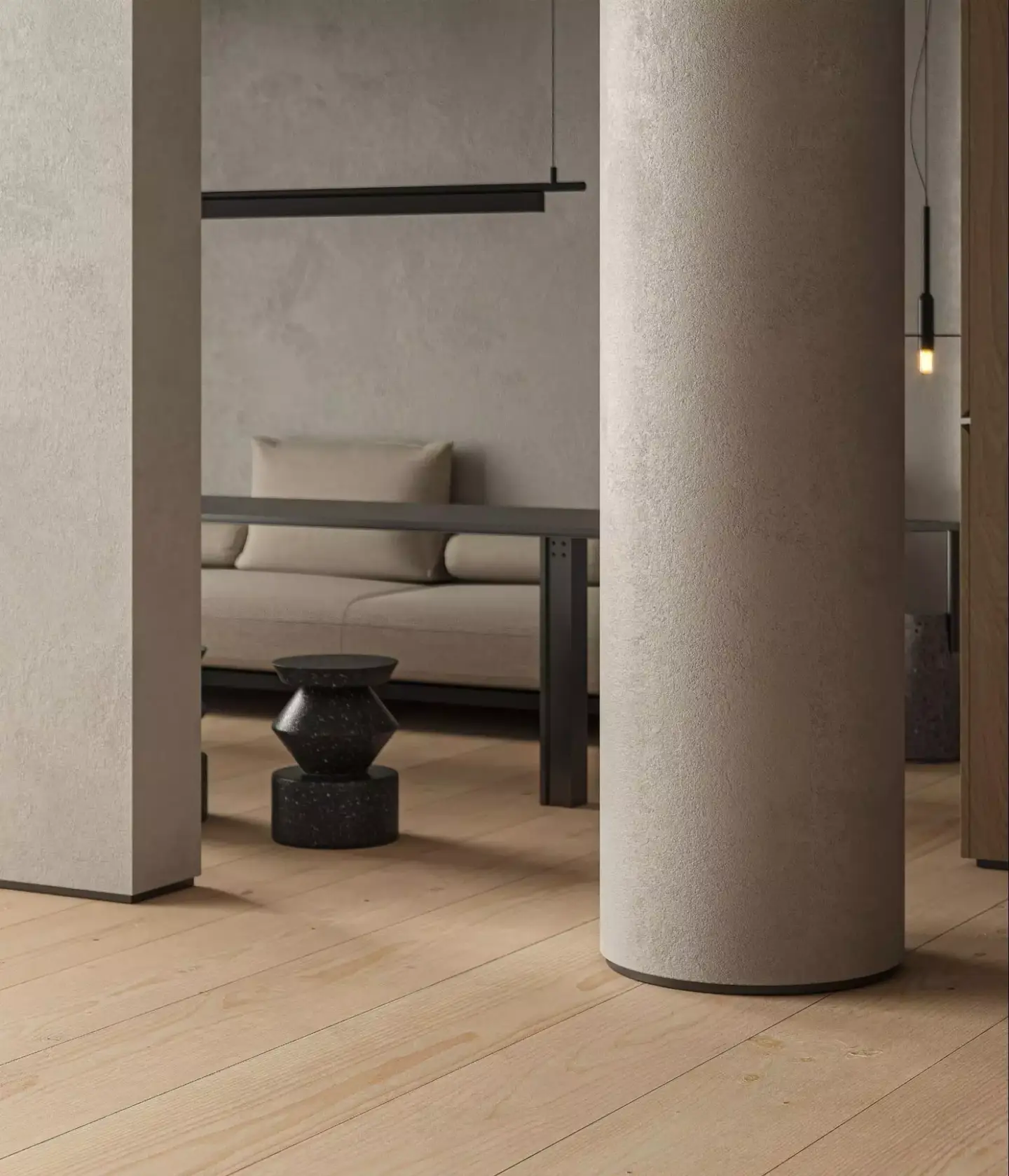
Wabi-sabi color palette and materials
A wabi-sabi palette stays soft, warm, and pulled straight from nature — think clay, oatmeal, taupe, muted sage, charcoal, and weathered off-whites. Colors are desaturated and low-contrast, so the eye rests. Materials do the talking, and they are almost always raw, matte, and aged rather than polished.
| Material | Why it fits wabi-sabi | Where to use it |
| Raw / reclaimed wood | Visible grain, knots, and age | Beams, flooring, low furniture |
| Lime plaster / limewash | Soft, uneven, hand-applied surface | Walls and feature niches |
| Stone & clay | Natural texture and tonal variation | Floors, basins, accent walls |
| Ceramics (handmade) | Irregular, glazed, one-of-a-kind | Tableware, vases, lighting |
| Linen & raw cotton | Loose, breathable, gently creased | Curtains, bedding, upholstery |
| Aged metal | Patina and quiet imperfection | Hardware, fixtures, accents |
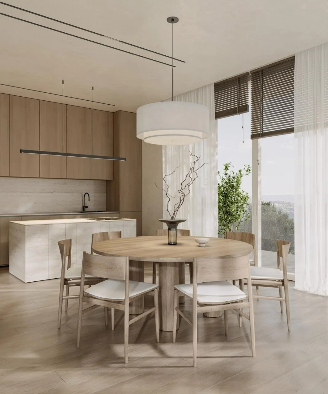
Wabi-sabi room by room
The philosophy adapts to every room, but the emphasis shifts with how each space is used.
Bedroom
A wabi-sabi bedroom leans into calm and softness: a low wooden or linen-dressed bed, crumpled natural bedding, a single asymmetrical artwork, and warm, dimmable light. Keep surfaces clear and let one handmade object anchor the room.
Living room
Build around comfortable, unfussy seating in linen or wool, a textured plaster wall, and a few aged or handmade accents. Negative space matters most here — resist filling every shelf, and let a branch in a ceramic vessel do more than a crowded display.
Kitchen
Open shelving with hand-thrown ceramics, stone or wood counters, and matte, aged hardware bring wabi-sabi into the kitchen. Honest materials beat high-gloss cabinetry, and visible wear is welcome rather than something to polish away.
Bathroom
Microcement or limewash walls, a stone basin, unlacquered brass fixtures, and natural light turn a bathroom into a quiet, spa-like retreat. A single woven or wooden element keeps it warm rather than clinical.
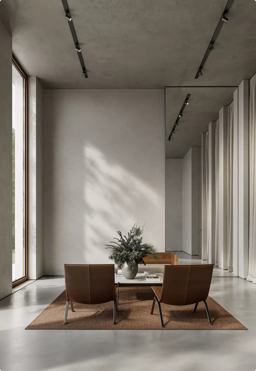
Wabi-sabi vs japandi vs minimalism
These three styles overlap heavily, which is why they get confused. All three value calm, simplicity, and natural materials — but their intent differs. Minimalist interior design chases clean reduction; japandi marries Japanese warmth with Scandinavian function; wabi-sabi specifically celebrates imperfection and age.
| Aspect | Wabi-sabi | Japandi | Minimalism |
| Core idea | Beauty in imperfection & age | Japanese + Scandinavian balance | Less is more, clean reduction |
| Surfaces | Raw, uneven, weathered | Smooth but warm, refined | Crisp, flawless, precise |
| Palette | Earthy, muted, organic | Warm neutrals + soft contrast | Neutral, often cooler |
| Mood | Lived-in, soulful, quiet | Cozy, functional, serene | Sleek, ordered, restrained |
| Imperfection | Celebrated and highlighted | Tolerated, kept tidy | Avoided |
How we visualize wabi-sabi interiorsFrom our studio — Clients genuinely mix up wabi-sabi, japandi, and minimalism, so we explain, ask questions, and collect references. But the references usually look the same too. In practice, a wabi-sabi room often ends up barely different from a japandi or minimalist one — the honest answer is that the line is thin.
Dim Kuzmenko, Maverick Frame
How we visualize wabi-sabi interiors
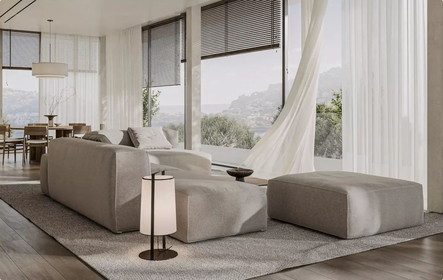
The hardest part of rendering wabi-sabi is not the geometry — it is the feeling. Imperfection has to read as intentional, not as a mistake, and that depends on materials, light, and restraint working together. We build it with high-resolution textures for plaster and wood, subtle asymmetry in layout, soft directional daylight, and deliberate empty space.
From our studio — The hardest thing about wabi-sabi is feeling it. If you’ve never been to the region — never been to Japan — it’s genuinely hard to tell wabi-sabi apart from any other modern or minimalist look. Getting it right is less about adding detail and more about sensing the mood the client can’t quite name.
Dim Kuzmenko, Maverick Frame
If you are planning a wabi-sabi project — for a portfolio, a listing, or a client pitch — photoreal 3D interior rendering services let you test materials, palettes, and light before anything is built. It is the fastest way to see whether a scheme reads as soulful wabi-sabi or drifts into generic minimalism.

Turn Ideas Into Visual Stories
FAQ about wabi-sabi interior design
What is wabi-sabi interior design?
Wabi-sabi interior design is a Japanese-rooted style that finds beauty in imperfection, age, and nature. It uses natural materials, handmade objects, asymmetry, and a muted earthy palette to create calm, lived-in spaces that feel honest rather than polished, new, or perfectly symmetrical.
What are the 7 principles of wabi-sabi?
The seven Zen principles behind wabi-sabi are kanso (simplicity), fukinsei (asymmetry), shibumi (understated elegance), shizen (naturalness), yugen (subtle grace), datsuzoku (freedom from convention), and seijaku (tranquility). Each one shapes a design choice, from clearing clutter to balancing a room through irregularity.
What are the three rules of wabi-sabi?
The three core truths of wabi-sabi are that nothing lasts, nothing is finished, and nothing is perfect. In a home, this means embracing wear and patina, leaving room for change, and choosing handmade or imperfect objects over flawless, mass-produced ones.
What is the 3-5-7 rule in interior design?
The 3-5-7 rule arranges objects in odd-numbered groups, such as threes, fives, or sevens, because asymmetry feels more natural than even, mirrored pairs. It echoes wabi-sabi’s fukinsei principle and is an easy way to style shelves, tables, and vignettes.
What colors are used in wabi-sabi design?
Wabi-sabi palettes stay soft, warm, and earthy: clay, oatmeal, taupe, charcoal, muted sage, and weathered off-whites. Colors are desaturated and low-contrast so the eye rests, drawn from natural materials like wood, stone, and plaster rather than bright or glossy accents.
Is wabi-sabi the same as minimalism?
No. Minimalism pursues clean, flawless reduction, while wabi-sabi embraces imperfection, texture, and age. Both keep spaces uncluttered and calm, but wabi-sabi rooms feel warmer and more lived-in, celebrating wear and handmade detail instead of crisp, precise surfaces.
Is wabi-sabi the same as japandi?
No, though they overlap. Japandi blends Japanese and Scandinavian design with refined, functional warmth, while wabi-sabi specifically celebrates imperfection and impermanence. Japandi surfaces stay smooth and tidy, while wabi-sabi leaves materials raw, uneven, and weathered, making age and texture the focus.
Is wabi-sabi still on-trend in 2026?
Yes. Wabi-sabi remains popular in 2026, especially in its calmer, more luxurious form using natural stone, clay, and warm wood. Its focus on slowness, craft, and imperfection appeals as a counter to glossy, mass-produced interiors, keeping it relevant for homes and design projects.
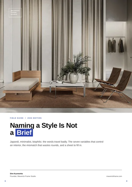
Free field guide
Naming a Style Is Not a Brief
Japandi, minimalist, biophilic: the words travel badly. The seven variables that control an interior, the mismatch that wastes rounds, and a sheet to fill in.