One Set of 3D Models, Every Visual the Range Needed
Nature Generation needed launch visuals for a four-product supplement range across a website, a store listing and social. We modeled the cartons, the bottle and the capsules once, delivered every launch format from those models, then carried them into studio sets, lifestyle scenes and a carton system for campaigns.
Client & Market Context
Four Products, One Shelf Presence, No Photography Budget for Either
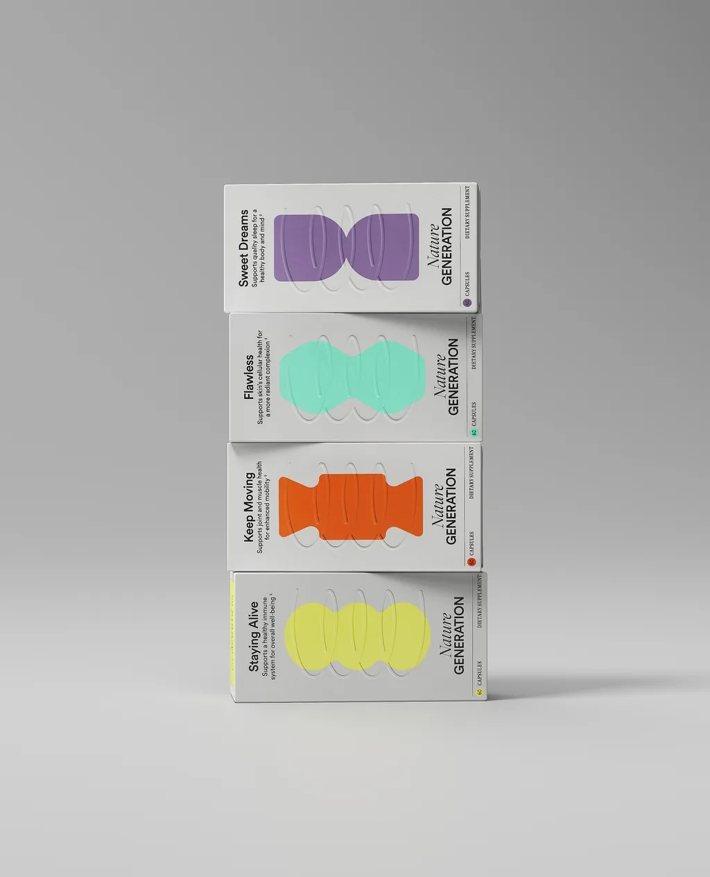
Nature Generation launched a range of four daily supplements — Sweet Dreams, Flawless, Keep Moving and Staying Alive — each with its own colour and its own reason to exist. The identity does most of the work on the carton face, so the range only reads as a range when the four sit together.
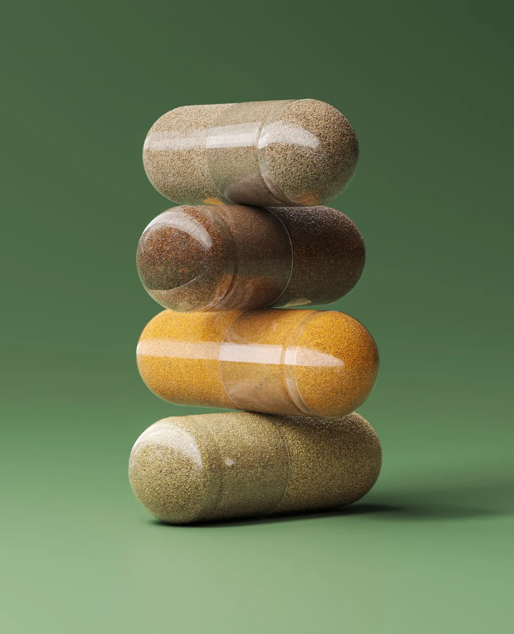
The brief started with the launch set: a website hero, a portrait crop, a square social post and a cut-out with a transparent background, for two subjects, the cartons and the capsules inside them. It did not end there. Each product also needed scenes of its own for social and paid campaigns, and the range needed a consistent way to show a single SKU, a pair and the full line.
Photographing all of that would have meant several studio days, stylists, models and locations, and a reshoot every time a channel changed its format or a campaign needed a new scene.
Lifestyle Round
Every Product in Its Own Scene
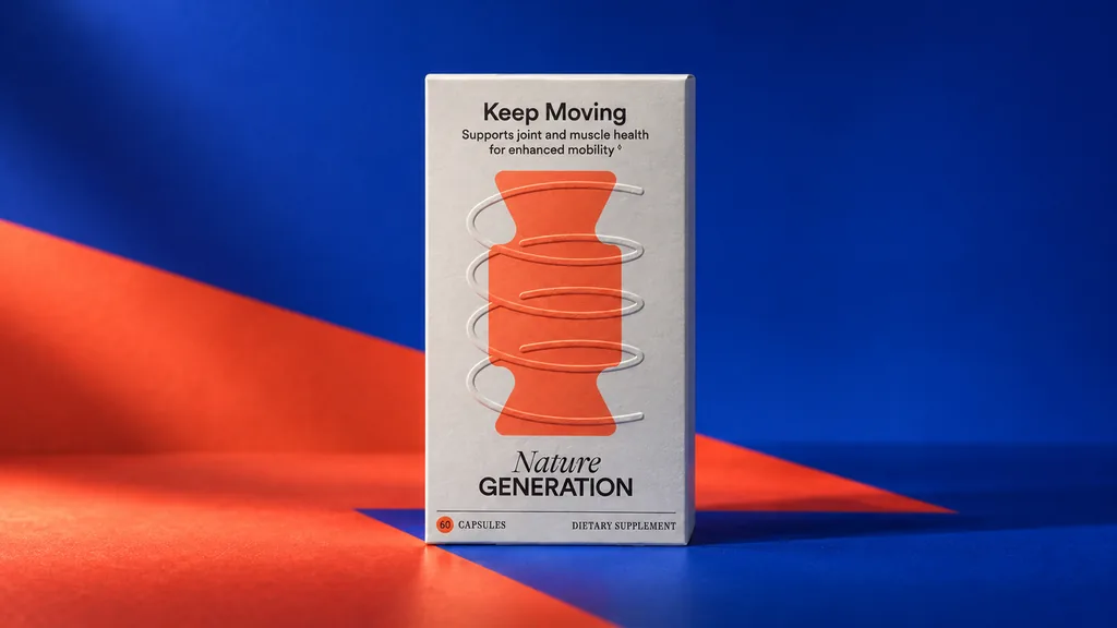
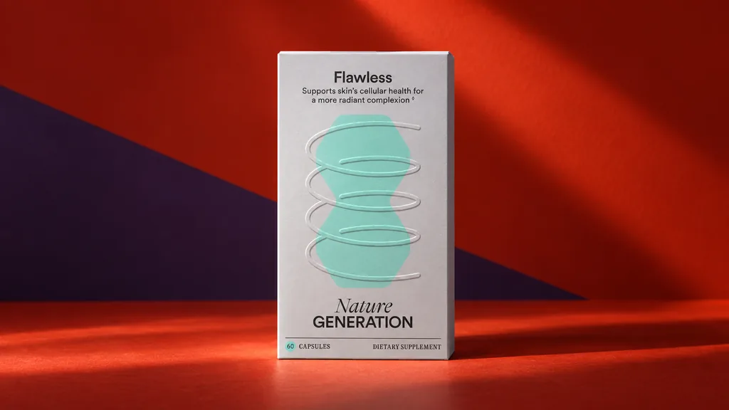
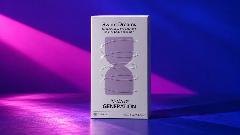
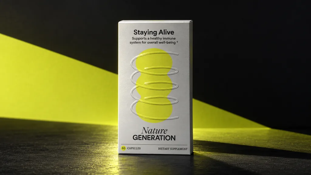
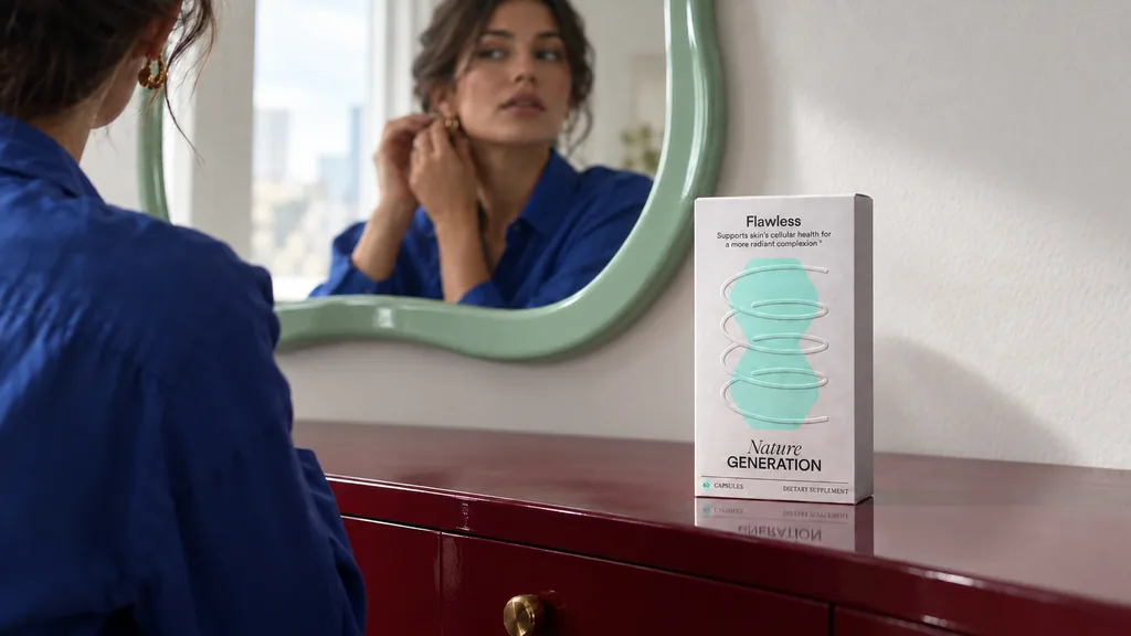
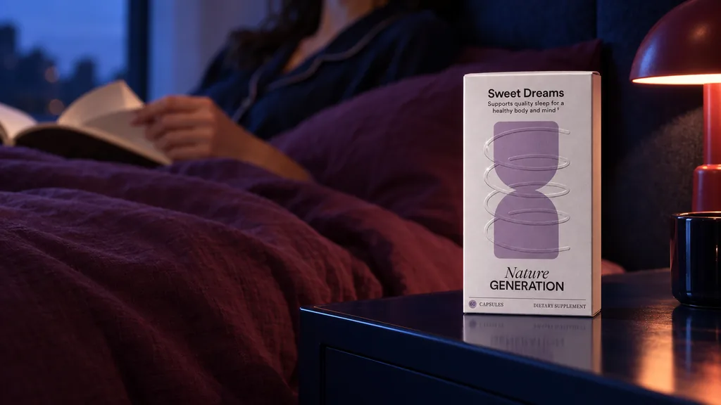
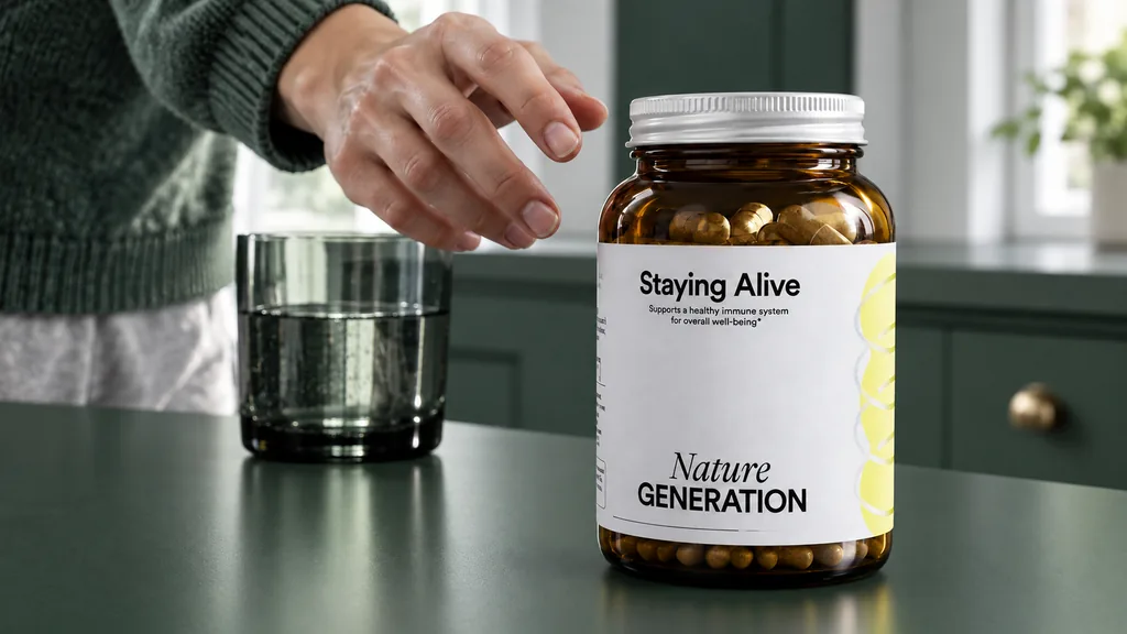
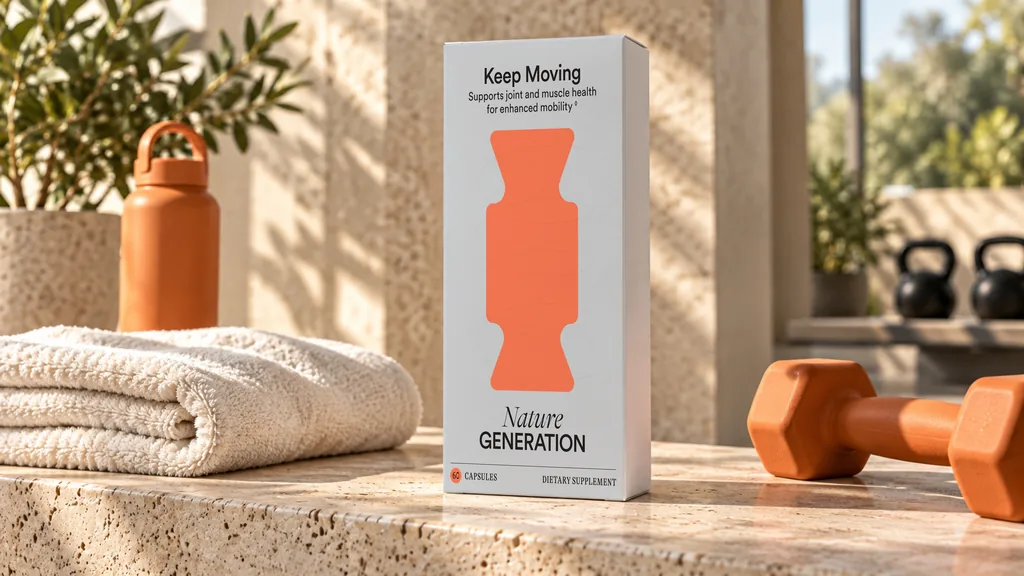
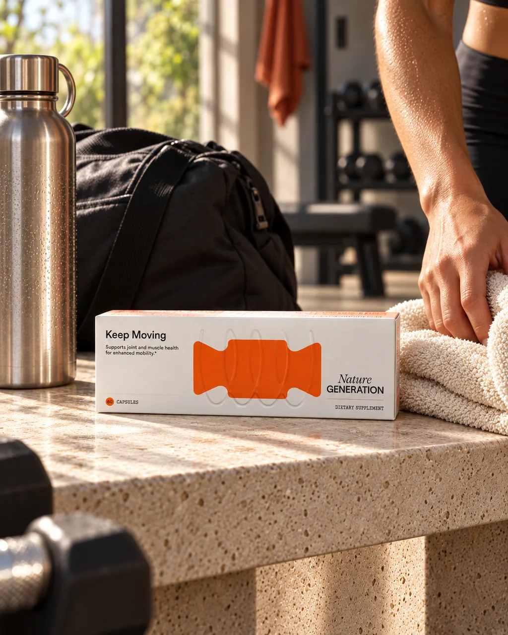
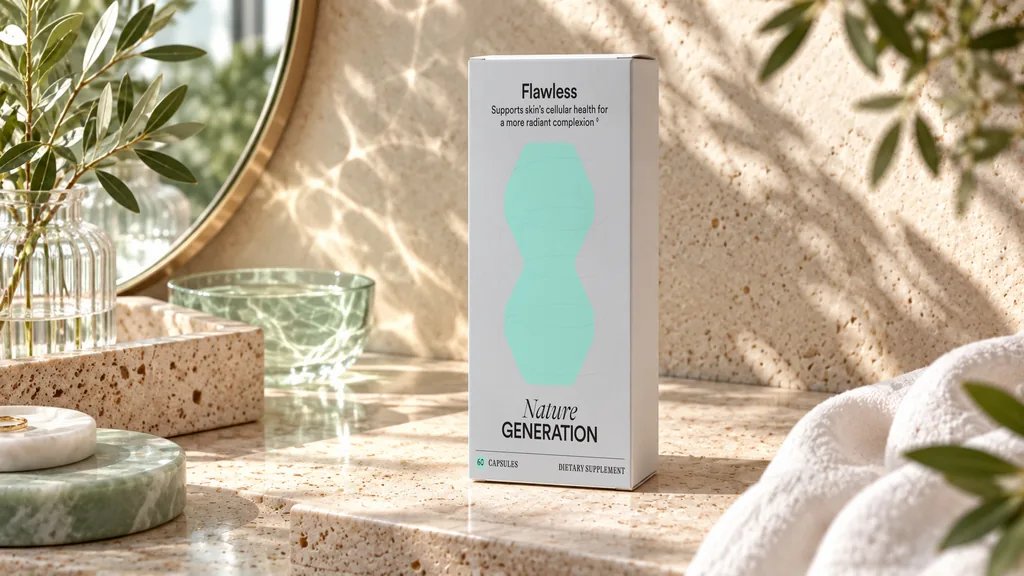
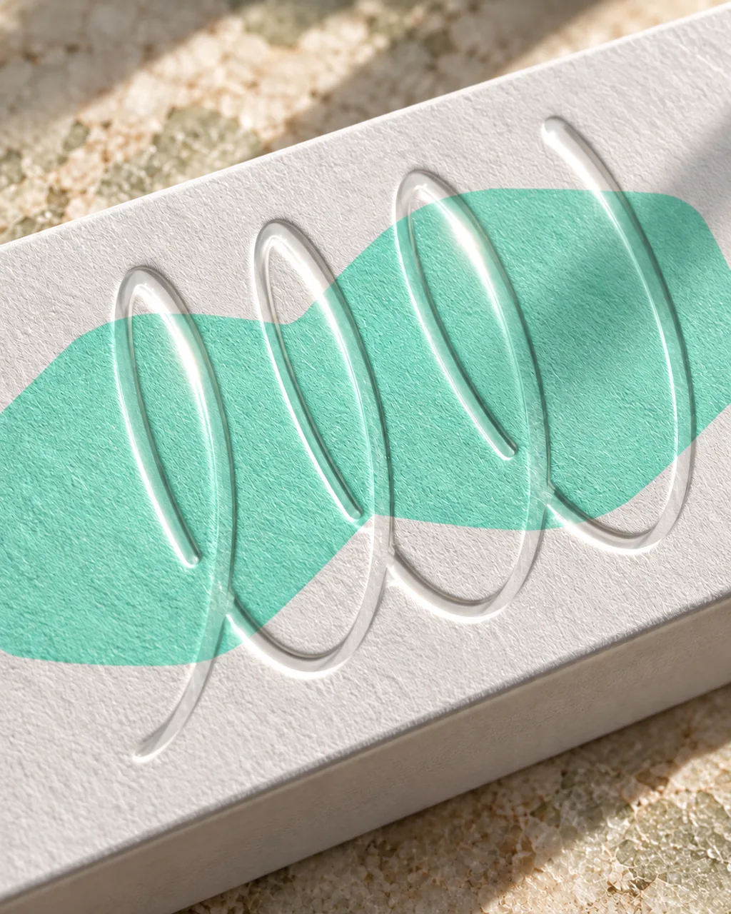
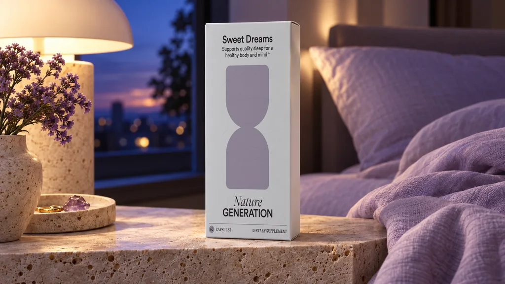
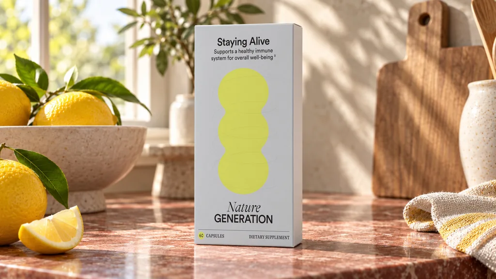
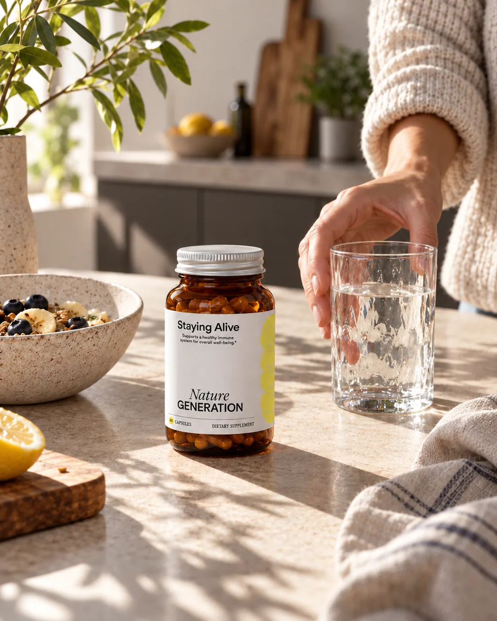
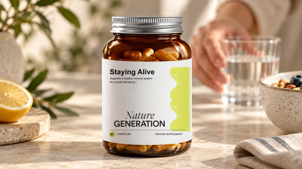
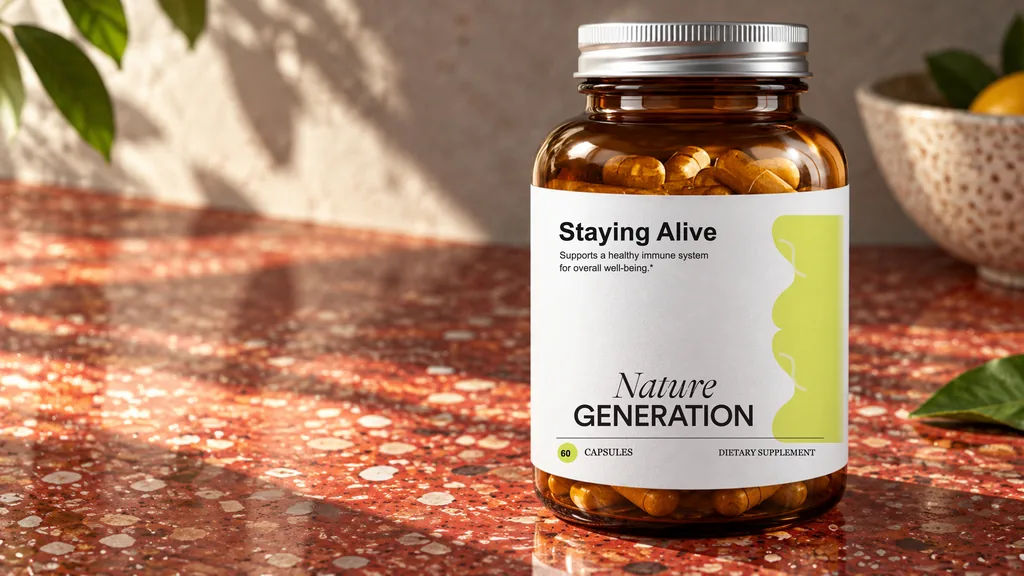
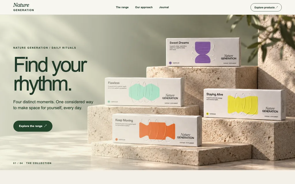
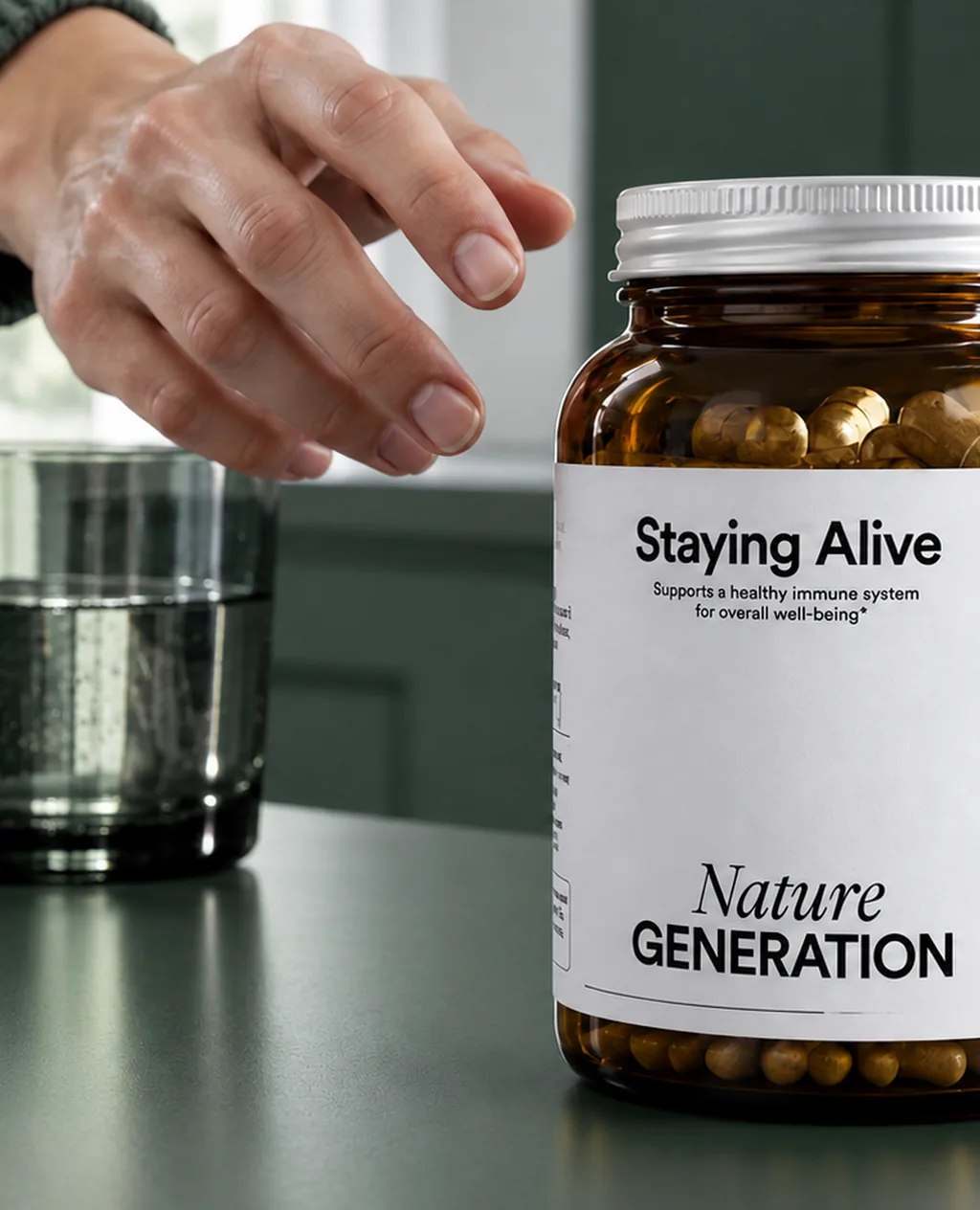
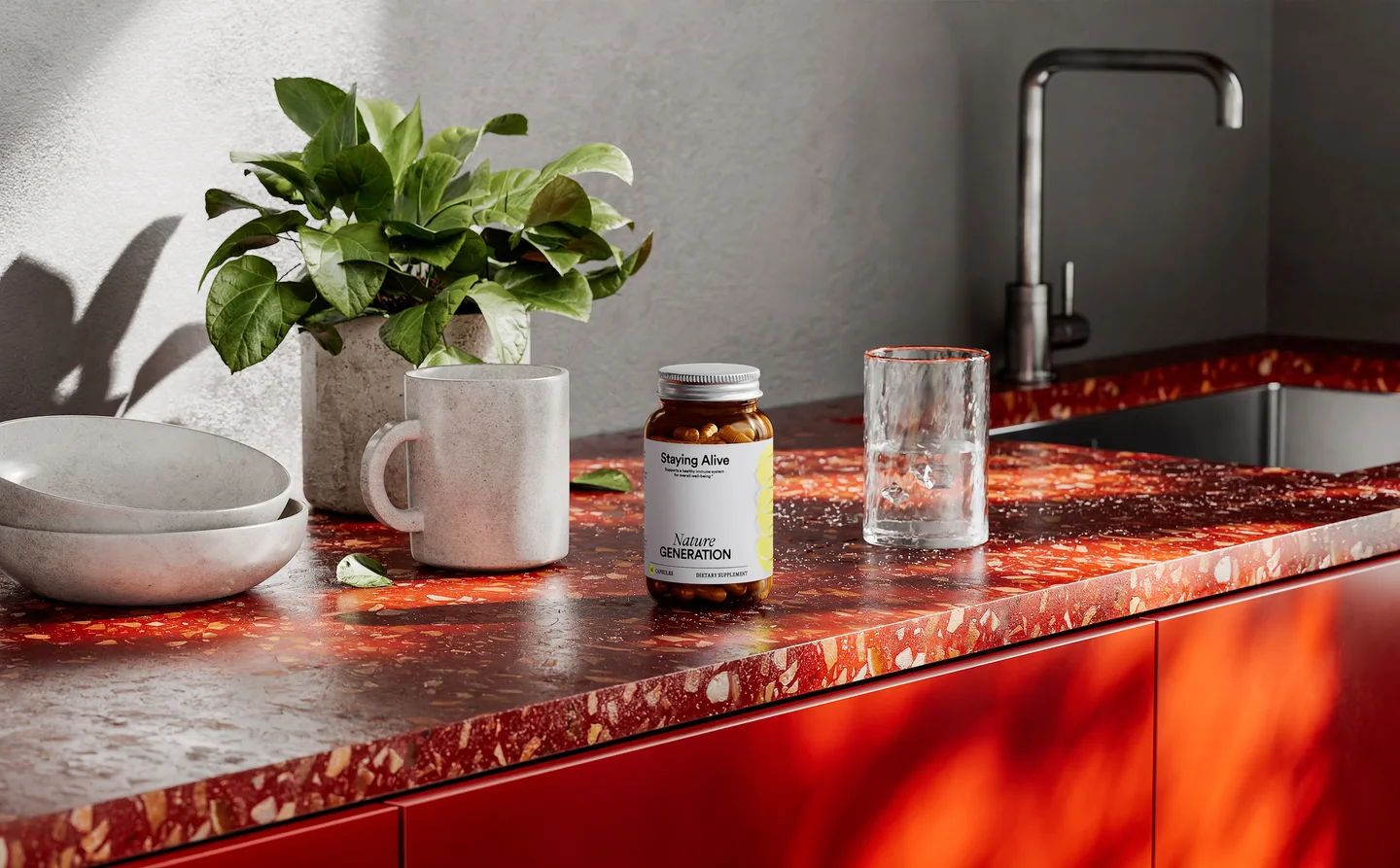
A bright studio set for each of the four cartons, the same cartons in everyday moments with people, then Keep Moving at the gym, Flawless at the vanity, Sweet Dreams on the nightstand and Staying Alive in the kitchen, plus bottle close-ups, an embossing macro and a homepage concept.
Business Challenge
A Range That Reads as a Set, Four Products That Each Need Their Own Scene
The launch set had two problems. The cartons had to stack so all four labels stay legible at thumbnail size, and the capsules had to show four visibly different fills, because “four products” means nothing if the contents look identical. The campaign rounds added a third: each product needed scenes that match its purpose — sleep, skin, mobility, immunity — without the four drifting into four different brands.
- Stack four cartons so every product name survives a thumbnail
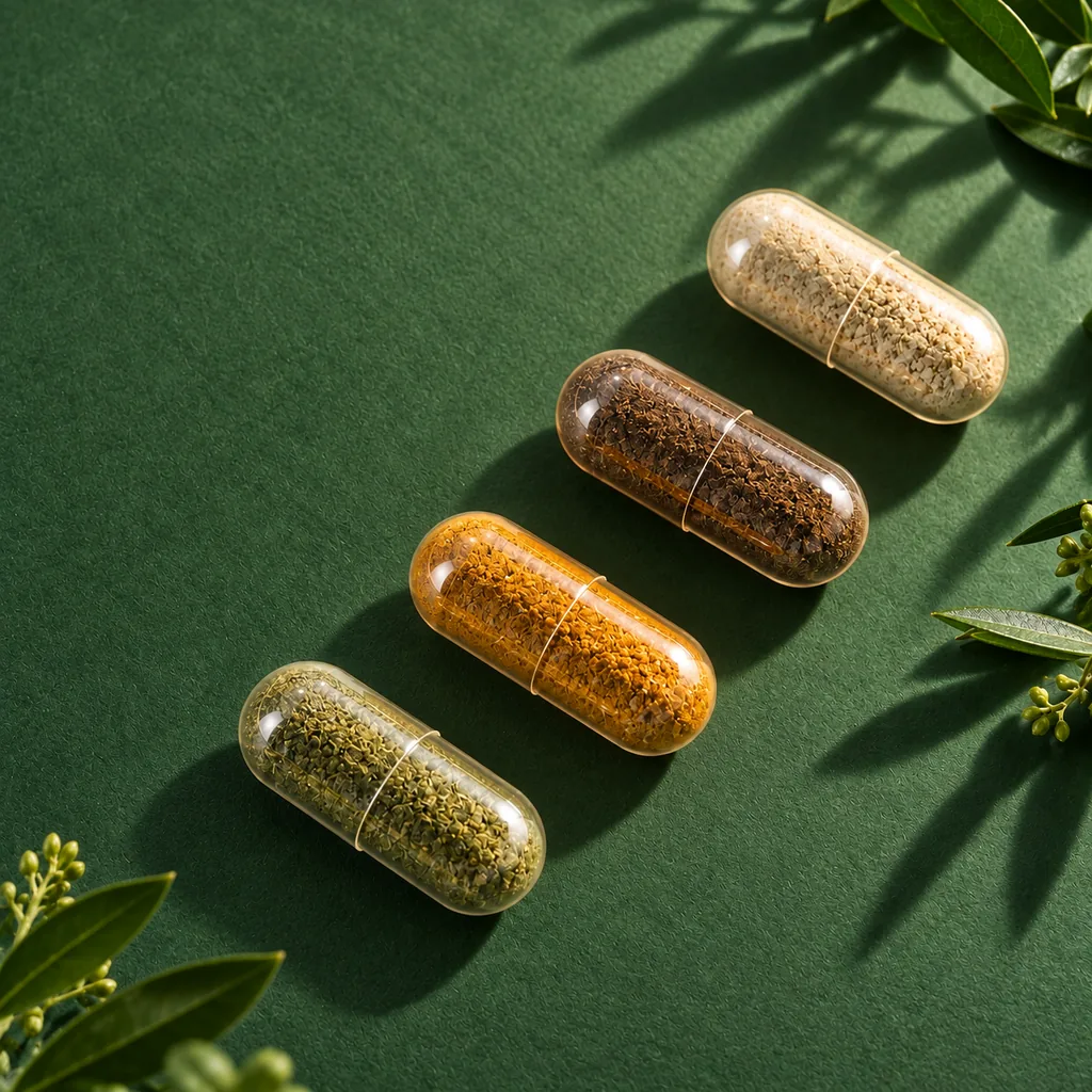
- Give each capsule a visibly different granule fill and colour
- Build a scene for each product that fits its use: gym, vanity, bedside, kitchen
- Keep carton artwork, emboss and colour identical in every scene
- Supply cut-outs with a real alpha channel, not a clipping path
The expensive failure here is easy to miss: the brand does not pay for one weak image, it pays for a new shoot every time a channel changes its format, a campaign needs a new scene or a fifth SKU joins the range.
Project Objectives
What the Launch and Campaign Visuals Had to Do
Make four separate products read as one deliberate range
Show the formulation itself, not just the label on the carton
Give each product its own lifestyle scenes for social and campaigns
Keep every model reusable for new crops, pairs and SKUs
Services Provided
Services Behind the Nature Generation Launch Visuals
Key Visual Decisions
From One Master Scene to a Carton System
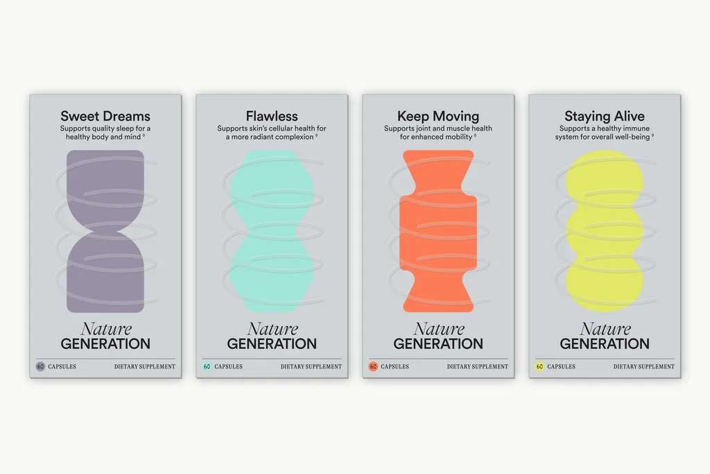
The Range, Front-On
All four cartons in one light setup, straight to camera. The range reads as one family on a product listing, a retailer deck or an A+ module, and a fifth SKU drops into the same row.
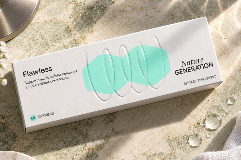
The Emboss, Up Close
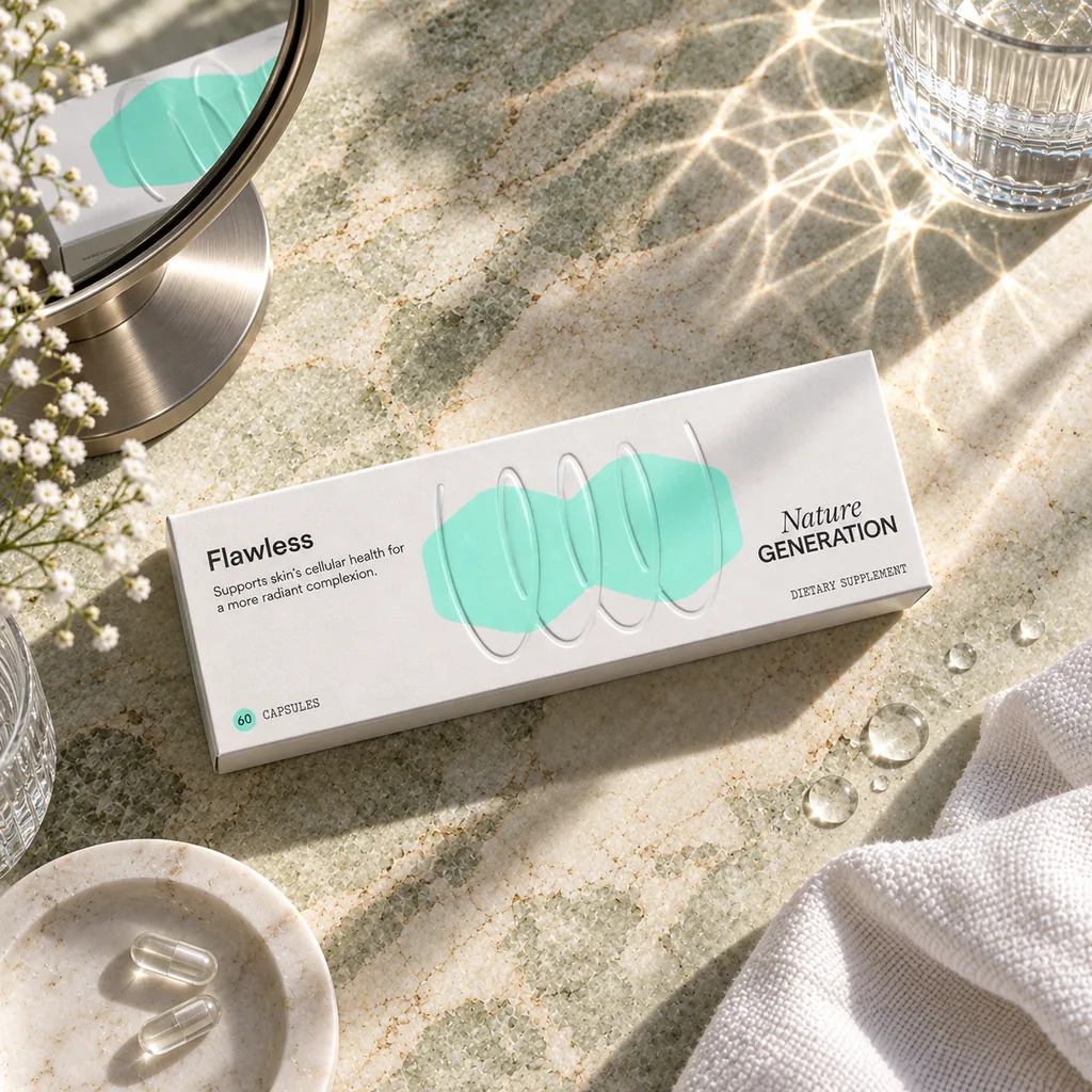
Flawless lying flat in dappled sunlight. The raised capsule outlines on the carton catch the light, so the finish reads on screen the way it feels in hand, and the colour panel stays true to the artwork.
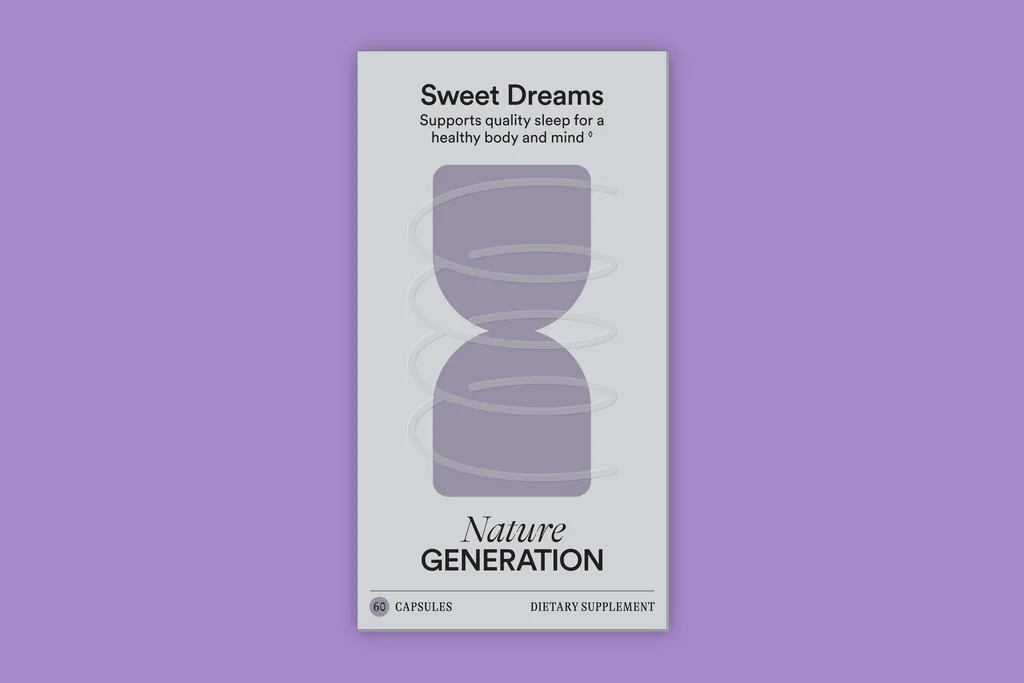
One Carton, Its Own Colour
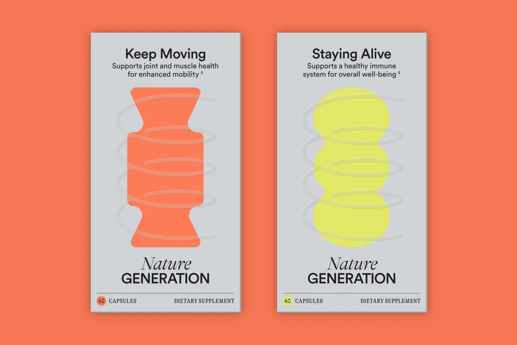
Each carton was also rendered alone on the colour of its own panel. The pack stays identical and the background carries the SKU, which gives social tiles and marketplace galleries a system.
Pairs for Bundles and Campaigns
The same carton models set up as pairs for bundle offers and seasonal campaigns. New combinations are a scene change, not a new render of the packs.
Production Process
From Carton Artwork to a Full Visual Library
-
Inputs & Look Development
We started from the carton dimensions, the bottle label and the print artwork for all four SKUs, modeled each product once, then built the kitchen set and the studio setup and lit each for a single mood. Approvals happened on cheap previews rather than on finished frames. -
Format-Specific Framing
Each deliverable got its own camera inside the same scene. Wide, portrait and social were framed and approved separately, and the cut-outs were set up as render passes with transparency rather than post-production masks. -
Delivery & Reuse
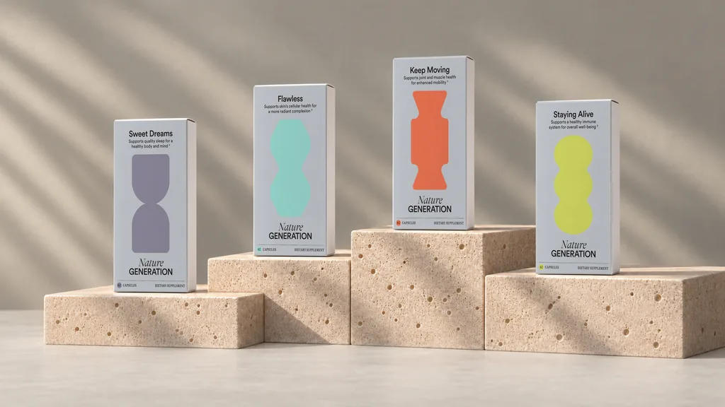
The launch set went out as layered masters and flattened exports per channel, together with the kitchen scene. Because the models and materials survive the project, the next rounds started from them rather than from zero: a bright studio set for each carton, everyday scenes with people, a line-up on stone steps, bottle and emboss close-ups, each carton on the colour of its own panel, pairs for bundles and a homepage concept.
Key Insight
FAQ about these supplement launch visuals
What are supplement launch visuals?
Can one render really cover every format?
Why is a cut-out better rendered than masked?
Do you need the physical product to render it?
How much does a fifth SKU cost once the scene exists?
What files does a studio need to start?
Can the same 3D models be used for lifestyle scenes?
Explore Similar Supplement and Nutraceutical Cases
3D Product Animation and Rendering for a Premium Product Launch in Germany
3D product animation and rendering for LIGRE’s premium espresso machine in Germany accelerated market entry and boosted pre-orders.

Mechanism-of-Action Animation for an Appetite-Management Supplement
Case study: two cellular-scale 3D animations for Calocurb that turn the brand’s own description of how its supplement works into something a buyer can watch.
A 360° Supplement Jar Spin and a Campaign Built on It
Case study: four camera setups and 494 transparent PNG frames of a Simple Science magnesium jar, then studio and lifestyle campaign stills from the same 3D model.