Baroque interior design is a 17th-century European style built on opulence, symmetry, and theatrical drama. It fills rooms with gilded carving, deep jewel tones, marble, velvet, and crystal chandeliers to project wealth and power. Born in Counter-Reformation Rome and perfected at Versailles, it remains the definitive visual language of luxury interiors.
What Is Baroque Interior Design?What Is Baroque Interior Design?
Baroque interior design is the decorative style of the Baroque period (roughly 1600–1730), defined by grandeur, movement, and a deliberate sense of theater. Every surface works to overwhelm the eye: gilded moldings, sculpted ceilings, and richly patterned textiles turn a room into a stage for status.
The style began in Rome as a tool of the Counter-Reformation. The Catholic Church wanted interiors that inspired awe and emotion, so architects and decorators replaced Renaissance restraint with drama, contrast, and scale. Absolute monarchs quickly adopted the same language—Louis XIV's Palace of Versailles became the most influential Baroque interior ever built, and the look spread across Europe as the default vocabulary of power and wealth.
Characteristics of Baroque Interior DesignCharacteristics of Baroque Interior Design
Baroque interiors share a fixed set of signature elements. The goal is always maximum richness, high contrast, and controlled symmetry that pulls the eye toward one dramatic focal point.
- Gilding and gold leaf on moldings, frames, furniture, and carved details.
- Heavily carved wood with acanthus leaves, scrolls, shells, and cherubs (putti).
- Deep jewel tones—ruby red, royal blue, emerald green—paired with gold and cream.
- Rich textiles: velvet, silk, brocade, and damask on walls, drapery, and upholstery.
- Marble and stone floors, columns, and tabletops, often in contrasting colors.
- Crystal chandeliers and ornate mirrors used to multiply candlelight.
- Trompe-l'oeil and fresco ceilings painted to suggest infinite, soaring sky.
- Colossal, symmetrical furniture on cabriole legs, grand in scale and ornament.
Symmetry is the discipline that keeps all this ornament from reading as chaos. Pairs of chairs, matched sconces, and a centered focal wall give the eye an axis to follow, so the room feels commanding rather than cluttered.
Baroque Color Palette, Materials, and Furniture
The Baroque palette is built on saturated jewel tones anchored by gold. Ruby, sapphire, and emerald carry the drama; gold and warm cream act as the connective tissue that ties the room together and catches the light. Black and deep bronze are used sparingly to sharpen contrast.
Materials are chosen for weight and reflectivity. Polished marble, ebony and walnut veneers, lacquer, gilt bronze (ormolu), and layered textiles all read as expensive because they either shine or absorb light in a way cheaper surfaces cannot. Baroque furniture follows the same logic: oversized case pieces, throne-like seating, and console tables carved with scrollwork and finished in gold leaf. Each piece is meant to be looked at, not just used.
Baroque vs. Rococo vs. Victorian: Telling the Styles ApartBaroque vs. Rococo vs. Victorian: Telling the Styles Apart
Baroque is constantly confused with the styles around it—especially Rococo, its lighter successor. The quickest test is symmetry and color: Baroque is bold, symmetric, and high-contrast, while Rococo is asymmetric, curved, and pastel. The table below sets the four most-confused styles side by side.
| Style | Era | Form & symmetry | Palette | Signature tell |
| Baroque | c. 1600–1730 | Bold, bilateral symmetry, heavy | Jewel tones + gold | Gilded carving, high-contrast drama, marble |
| Rococo | c. 1720–1780 | Asymmetric, light, curved | Pastels—cream, pale blue, pink | Shell & scroll (rocaille), delicate gilding |
| Victorian | 1837–1901 | Eclectic, layered, crowded | Dark, rich, mixed | Mass-produced ornament, mixed revivals |
| Neoclassical | c. 1760–1830 | Strict symmetry, restrained | Muted, soft | Straight lines, columns, classical order |
The clearest way to remember it: Rococo is Baroque that put down the crown and picked up a fan. It kept the gilding but traded power and symmetry for intimacy, movement, and lightness. Marie Antoinette's interiors are Rococo, not Baroque—a common mix-up worth flagging.
Baroque Interior Design vs. Baroque ArchitectureBaroque Interior Design vs. Baroque Architecture
Baroque interior design and Baroque architecture are two halves of one movement, but they solve different problems. Architecture shapes the shell—the curved facades, domes, colonnades, and dramatic massing of a building. Interior design works inside that shell, dressing walls, ceilings, and rooms with the gilding, textiles, and furniture that make the space feel alive.
They developed together, which is why the two terms blur. A Baroque church or palace was conceived as a total work of art: the architect designed the volume and the light, and decorators filled it with fresco, marble, and gold so the structure and its surfaces read as a single, overwhelming statement. When you are researching the style, decide first whether you mean the building or the room—the elements, budget, and references are different for each.
Modern Baroque Interior Design in 2026
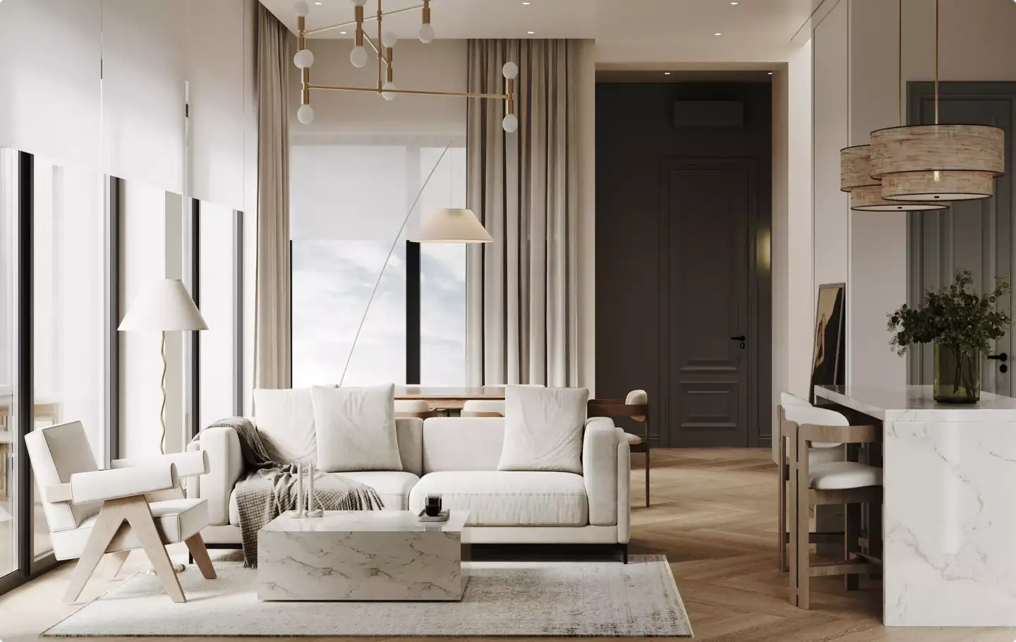
Modern Baroque—also called neo-Baroque—keeps the drama but drops the period-room maximalism. Instead of gilding every surface, it isolates one or two theatrical gestures against a calm, contemporary backdrop: a single carved gilt mirror over a matte plaster wall, a crystal chandelier in a room of clean lines, or an emerald velvet sofa as the only ornate object in an otherwise restrained space.
The most current version leans dark. "Dark Baroque" swaps the bright gold-and-cream palette for black, charcoal, and deep bottle green, with gold used as a thin accent rather than a flood. This reading is the one gaining traction in 2026 because it lets Baroque's opulence coexist with modern minimalism—one bold focal point does the work that an entire gilded room used to do.
Regional Baroque Styles Around EuropeRegional Baroque Styles Around Europe
Baroque was never a single look. As it spread from Rome, each country bent it toward its own taste and materials.
- Italian Baroque is the original: the most sculptural and church-driven, heavy on fresco ceilings, marble, and dramatic light.
- French Baroque is the Versailles version—the most regal and disciplined, with mirrored galleries, ordered symmetry, and gilt bronze.
- Spanish Baroque (Churrigueresque) is the most densely ornamented, packing carved detail edge to edge.
- English Baroque is the most restrained, blending Baroque drama with classical proportion for a heavier, more sober result.
How We Render Baroque Interiors
Baroque is the style that separates a render that looks expensive from one that looks like a costume. Because every surface is reflective, carved, or patterned, small material mistakes compound fast—and the difference between "palace" and "props" comes down to how the light behaves, not how much gold is on screen.
| Element | Why it's hard to render | How we handle it |
| Gold leaf / gilding | Reads as flat yellow if treated as a color | Metallic shader with low roughness so it reflects, not glows; cap gilded area near 15–20% of the frame |
| Carved wood & acanthus | Normal maps flatten at the silhouette | Real geometry on hero carving; texture maps only on background trim |
| Crystal chandelier | Refraction and caustics are the heaviest compute | Treat it as one hero light source; bake caustics selectively instead of everywhere |
| Damask & velvet | Sheen and pile direction vanish under flat shading | Sheen/anisotropic shading with directional pile so fabric catches light |
| Marble | Looks painted without depth | Subsurface scattering plus real vein displacement, not a photo texture |
In our studio, the hardest part of a Baroque render is restraint. The instinct is to gild everything, but a frame that is uniformly gold has no contrast, so nothing reads as luxurious—the eye has nowhere to rest. We treat gold as a highlight, not a base color: one hero focal point (a mirror, a ceiling, a chandelier), a controlled value range so the metal has something dark to shine against, and calmer surfaces carrying the rest of the room. Baroque done well is disciplined maximalism, and that discipline is exactly what makes it convincing in a 3D interior rendering.
Whether you are studying the period or planning an opulent room of your own, Baroque rewards a clear focal point and honest materials over sheer quantity of ornament. For more on where it sits among historical and contemporary looks, see our guide to interior design styles.