How Product Design Turned Trip-Planning Chaos Into a Launch-Ready App Travelers Recommend
We gave Escape one calm, guided product — a mobile app and a matching website on a single design system — that users grasp at a glance, plan trips 3× faster with, and recommend 98% of the time.
- Travel App
- UI/UX Design
- Web & App Design
Client & Market Context
The Client and the Problem We Solved
Escape came to us with a familiar problem: travelers love the idea but drown in planning — ten tabs, scattered notes, endless reviews. They needed one product that turned that chaos into a calm, guided flow, consistent across a mobile app and a marketing website so the brand felt the same everywhere. Our job: make trip planning feel effortless — and make the product launch-ready.


Business Challenge
Turning Planning Chaos Into One Calm Flow
Travellers juggle too many tools before a trip — and lose confidence along the way.
- No single place to discover, compare and save
- Too many steps between an idea and a booked trip
- An inconsistent experience across app and website
- Decisions made with low confidence and high stress
Without a focused, guided experience, people abandon planning — and the booking never happens.

Results & Business Impact
-
94%
understood every option at a glance
-
3×
faster from idea to a planned trip
-
70%
less back-and-forth while planning
-
98%
of users would recommend Escape
Project Objectives
Product Design Goals
-
Make destinations easy to discover and compare
-
Bring stays, food and tours into one clear flow
-
Keep the app and website visually consistent
-
Help people plan and decide with confidence
Services Provided
Our Toolkit for the Build
Strategic CGI Approach
How We Designed for Decisions, Not Just Screens

Key Visual Decisions
Design Decisions That Drove the Result


Product-Focused Composition
Whitespace and real photography make browsing feel premium and calm — the reason planning needed 70% less back-and-forth.

Atmosphere Through Light and Space
Real-world mockups gave the product emotional context, helping Escape sell the experience in stores, ads, and investor decks.

Lifestyle-Driven Detail Scenes
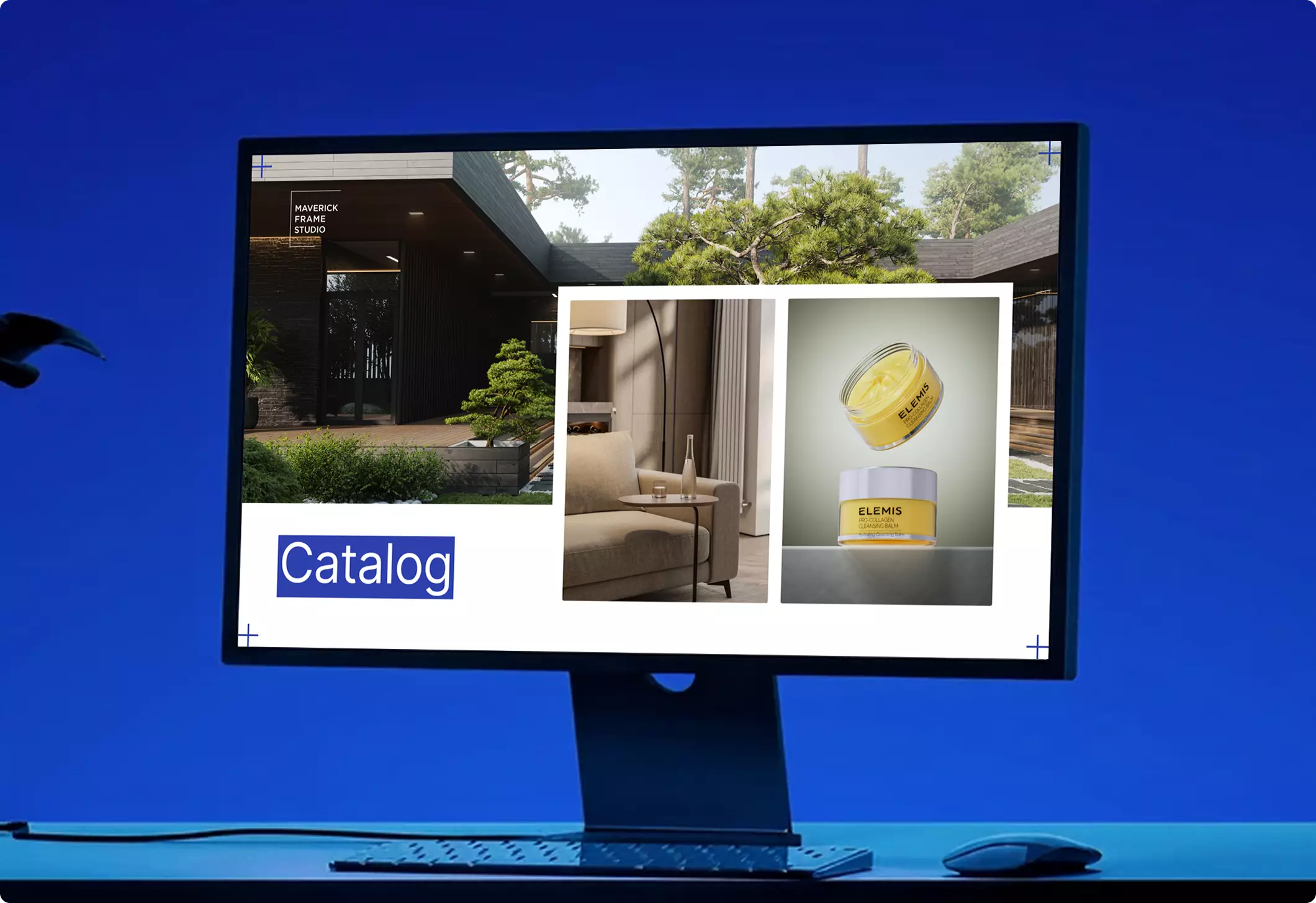
One design system across app and web keeps the brand coherent everywhere — protecting trust from the first ad to the booking.

A Consistent Identity Across Devices
The same type, colour and rhythm carry from phone to web, so the brand feels coherent wherever users meet it.
Production Process
From Concept to Shipped Product
Visual Results
Screens That Feel Effortless


Marketing & Sales Usage
Driving Installs and Engagement
The visuals powered the following:
- App Store and Google Play listings
- Landing page and web marketing
- Investor and stakeholder decks
- Social and launch campaigns
Key Insight


Explore Similar Real Estate Cases